StartupCentral - Website Design
A SaaS company focusing on entrepreneurs and small companies.
Introduction
StartupCentral is a benefit club for entrepreneurs that focuses on client relationships and partner deals with other firms. The premise of the company is to create an online social platform where entrepreneurs can find help and information about starting and managing a business no matter whether they just want to start, or they have already started the process.
In this Project, we revamped the user experience and redesigned the UI, which is one of the largest projects at StartupCentral since the foundation.
The Problem
The conversion rate was low and the drop off rate was high on the old website. Due to low usage, the company never prioritised improving on or building new features for the website. The users did not understand how they can use the discounts for the partners and how to contact the mentors.
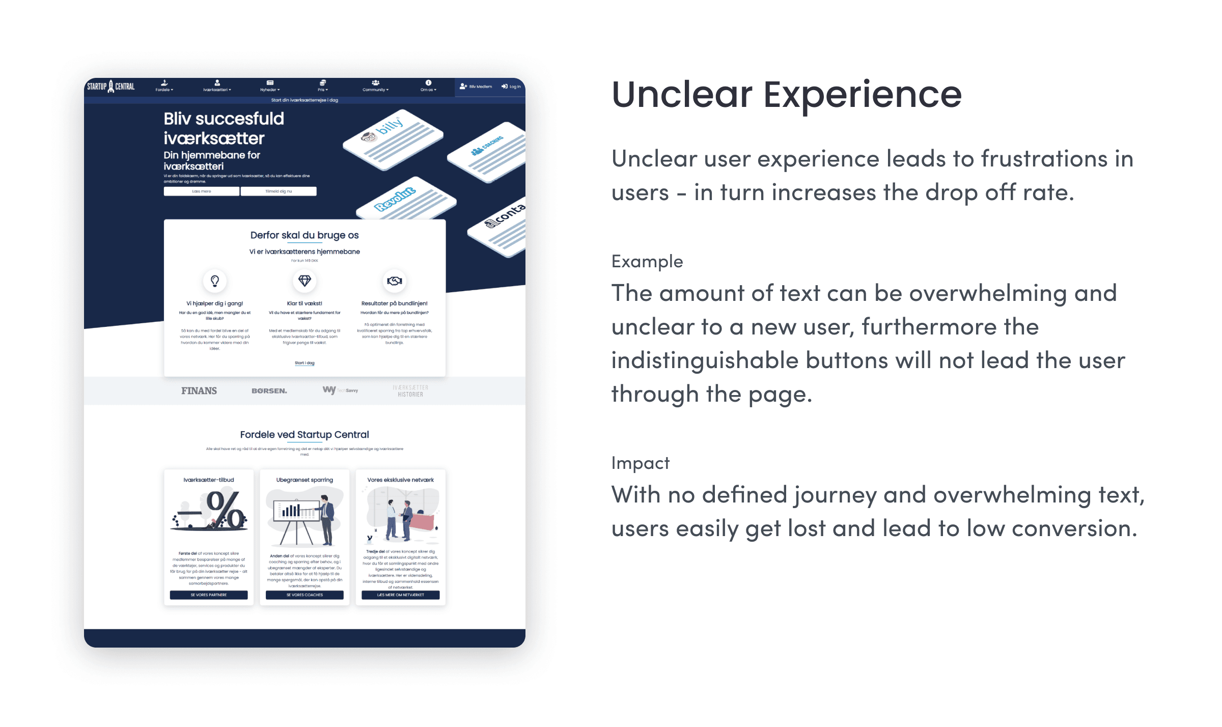
StartupCentral lacks a distinct colour pattern
Startupcentral needs to establish a proper company colour for easier brand recognition and a full colour-palette that goes with it. Establishing what colours should be used and where should be used will subconsciously tell the users where they can gather information.
The old landing page is outdated
It has not gone through a redesign for over 2 years. The design language is not consistent through the website. The old landing page shows only blue and white colours and there are no distinct buttons that would indicate where the user should click.It has not gone through a redesign for over 2 years. The design language is not consistent through the website. The old landing page shows only blue and white colours and there are no distinct buttons that would indicate where the user should click.
The existing site’s visitor metrics could be improved
We want the users to be able to quickly find brief information on the main page, and we would like to keep them on different pages where they can clearly find the information that they are looking for.
Distinction between the landing page and the logged in page
After registration the user can use the discount codes, and the mentors however the users cannot distinguish easily whether they have logged in to the website or not. A clear distinction is required for visual clarity.
The Goal
Communicate StartupCentral’s value proposition
To give a clearer messaging. Show our users where and how they could get value from our product.
A delightful, consistent consumer experience
To ensure a proper design system is in place to reduce technical debt, and give our consumers a better, consistent experience across multiple devices.
Drive customers to StartupCentral
To attract potential customers who want to use StartupCentral to grow their business.
Problem Statement
After the goals have been identified, I came up with a problem statement that I could refer back to as I proceed with the design process.
How might we design an entrepreneurial website for those who would like to start their own business so they will see the value of our paid services.
How might we design a fashion e-commerce website for those who shop online so that they can have a more efficient and error-free experience?
The Process
Empathise
Because design thinking emphasises the importance of human-centered design, the first step of the process is to emphasise. This essentially gives me the chance to gain insight about the thoughts, feelings, and needs of the user base.
User Interviews
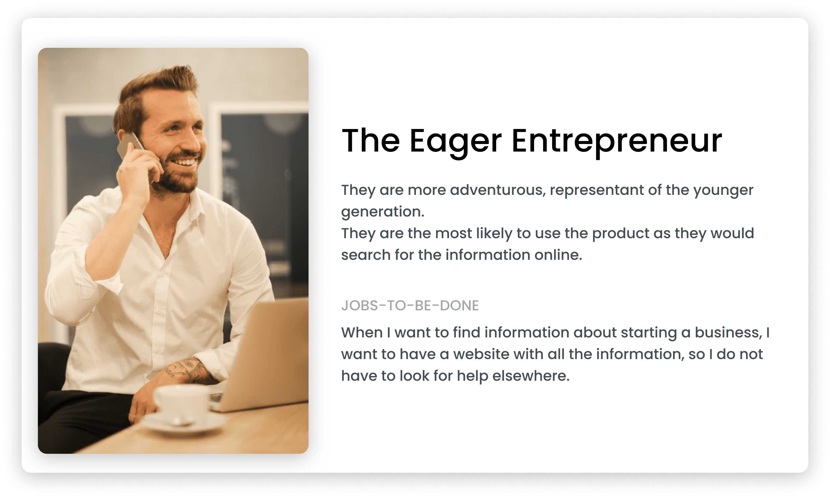
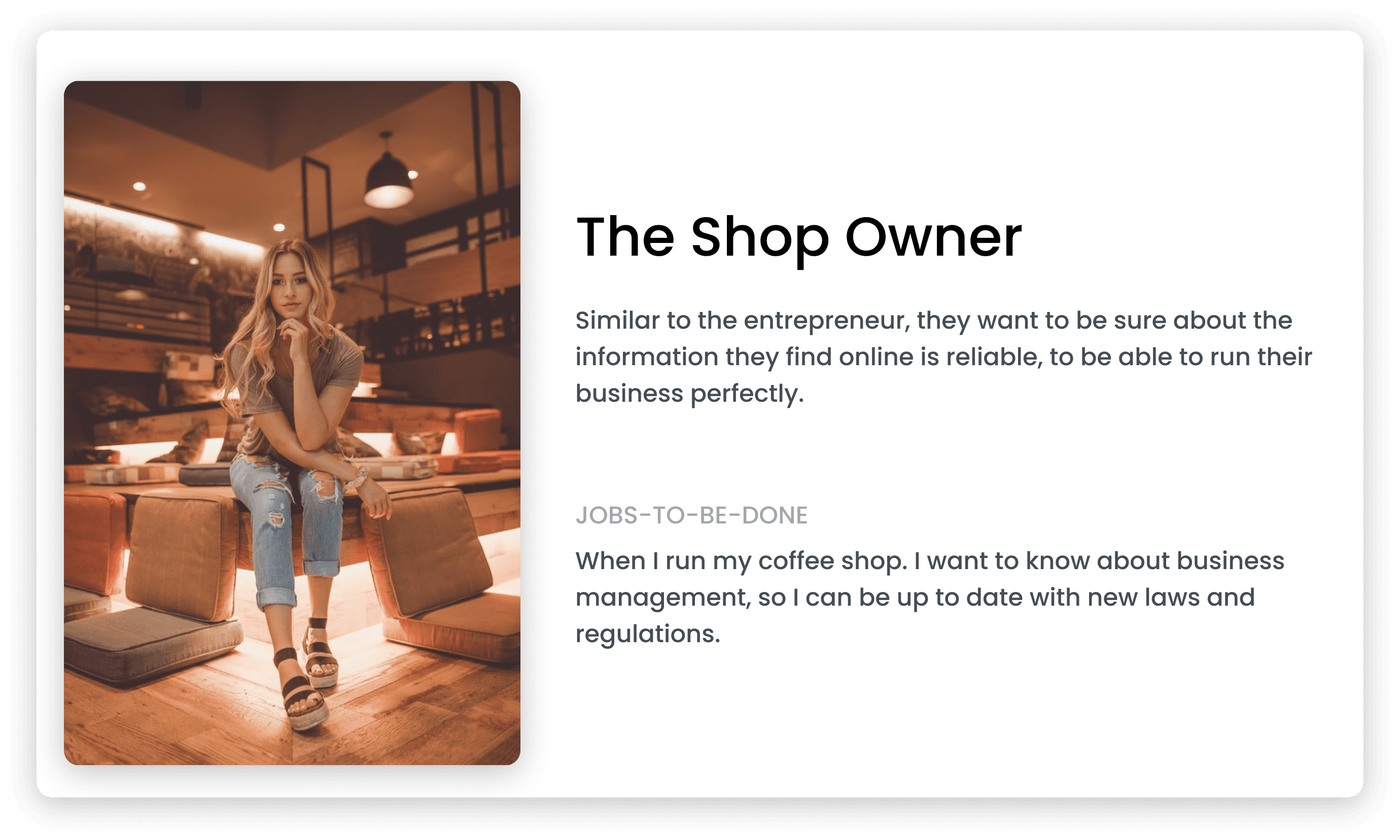
I conducted interviews with users who were familiar with the existing platform, this gave me the opportunity to identify their needs and pain points. Startupcentral’s user base covers a wide range of demographics, I interviewed a total of 5 people between the ages of 18 and 50. Their profession varied from student, engineer, entrepreneur, and business owner.
To read more about the interview guide that was prepared in advance click here.
A detailed report of the interviews can be seen here.
Summary of the findings from the user interviews:
Some of the participants noted during the interviews:
“I often look at review sites such as TrustPilot to find out whether the quality of service is good.”
“I am close to graduating and I don't really know anything about entrepreneurship. I think this site is a good initiative for someone who is inexperienced in the field.”
“I want to be sure that I pay for gives me a lot of value”
Define
The next step in the process is to define. With the research conducted thus far and the findings from the user interviews, I was able to figure out what will be created, for whom, and how.
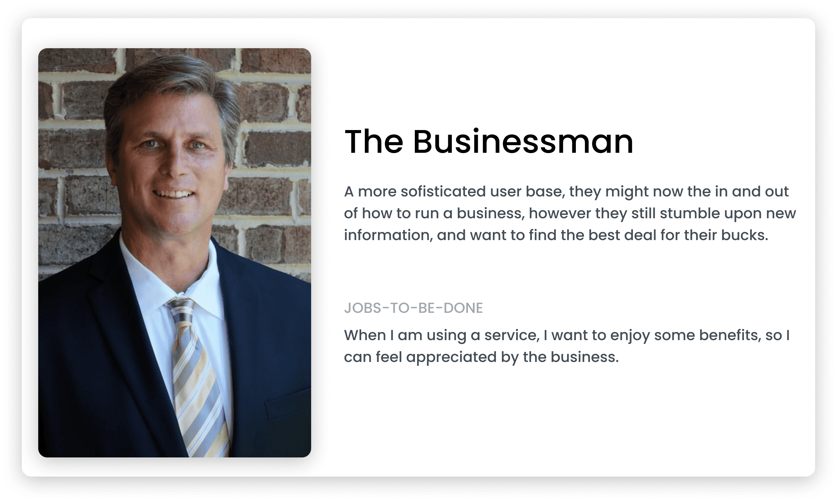
User Persona, Empathy Map, and Project Goals
Based on the insight provided the participants during the user interviews, I created a persona that reflects various needs and pain points.
Ideate
After defining the personas the Project goals, it is time to focus on a more creative approach and generate ideas. By using the findings that I got from the previous steps it was time to think of a visualisation of the site.
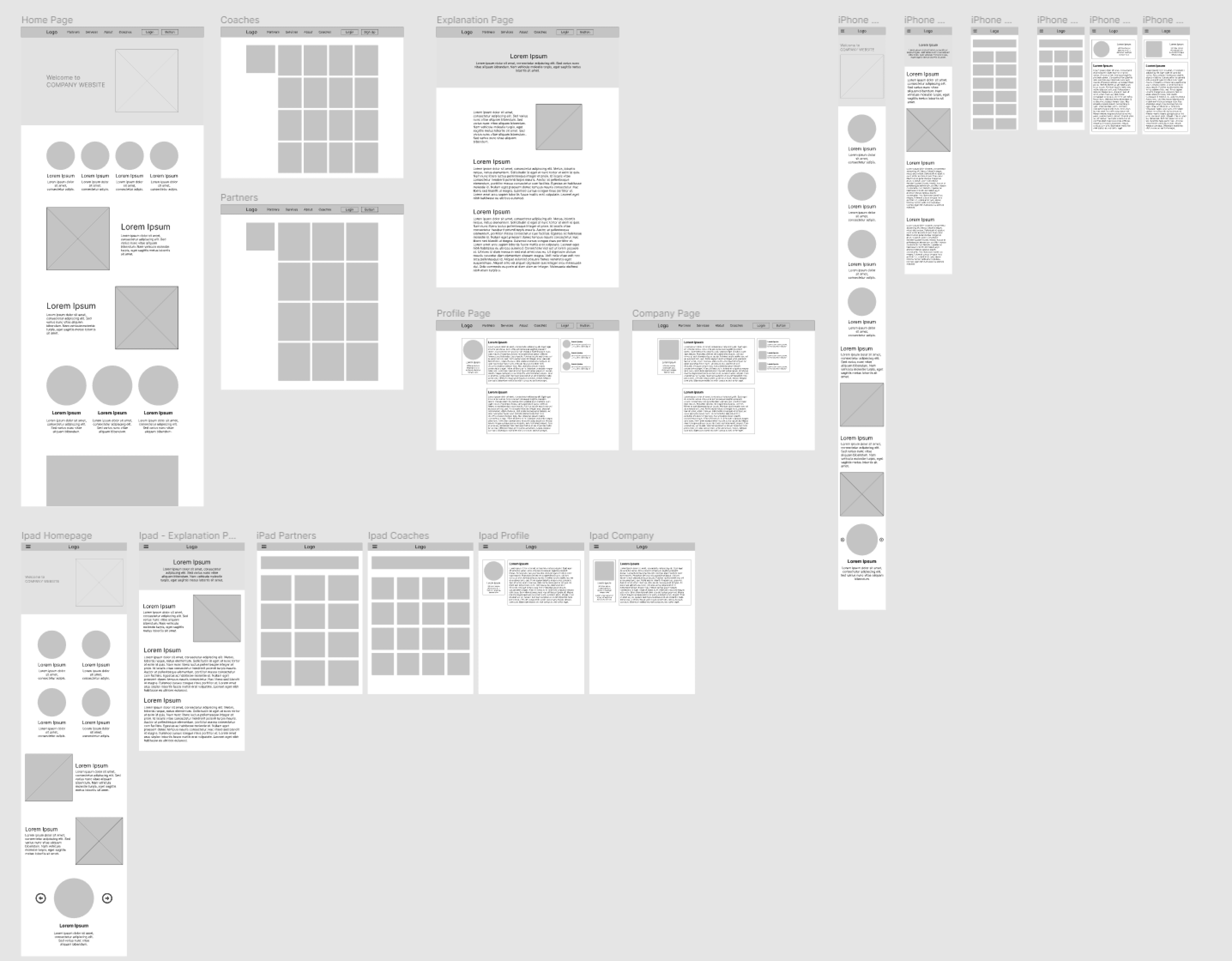
Early concepts
This is how the some of the early wireframes looked like. After revamping the home page the main focus was put on the coaches, the partners and the explanation page. The designs went through many iterations before the team decided on the final concept.
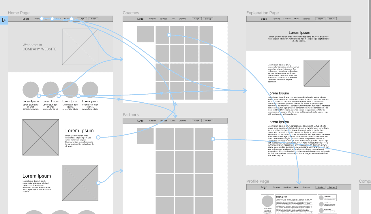
Prototyping
In the low-fidelity prototype I connected all of the screens involved into a primary user flow. The user can choose the coach page, and from there he can go to the coaches' personal pages.
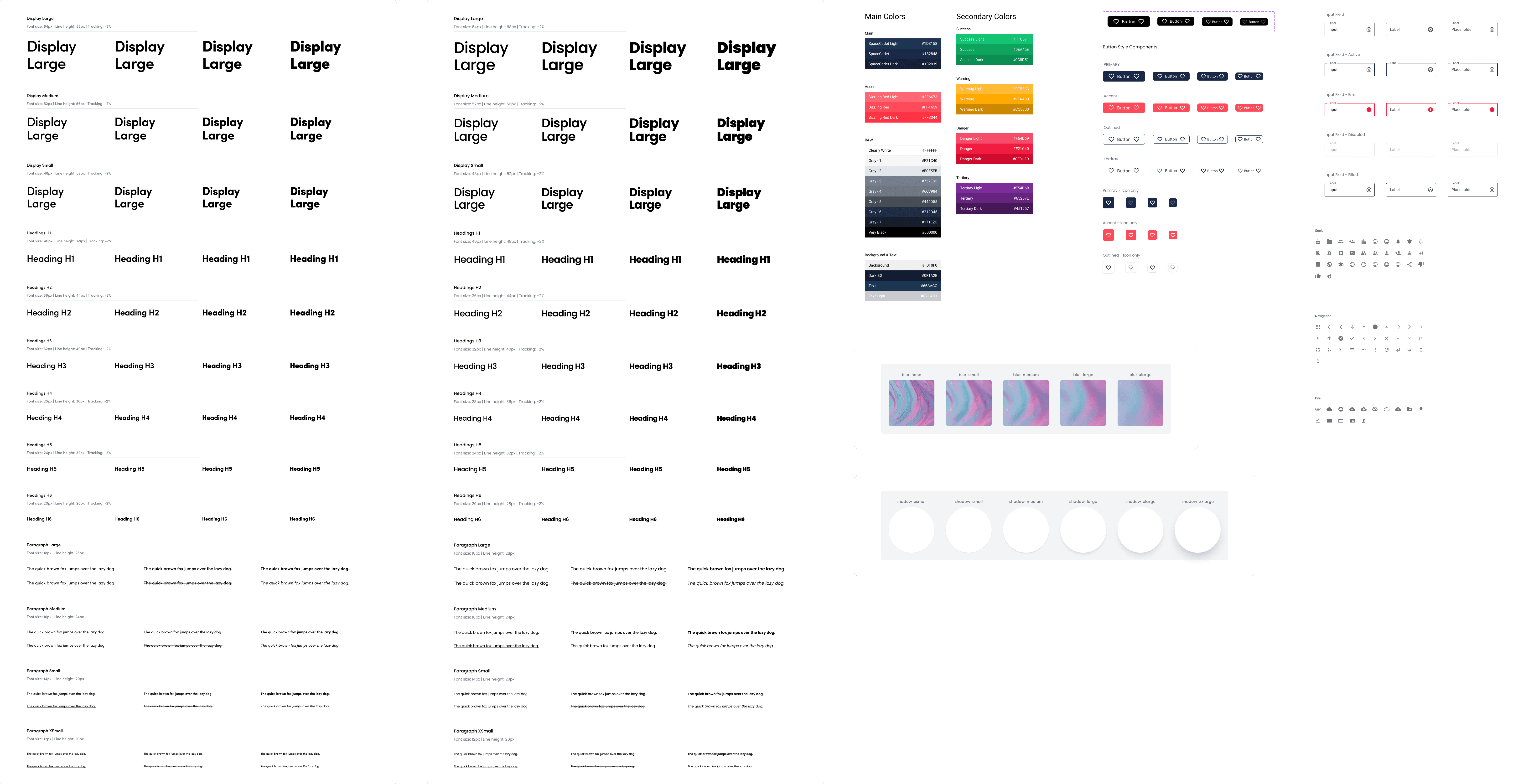
Design System
The company desperately needed a design system for easier implementations as the company strives to expand in the future. This new design system will help in the extension of the company.
Moreover Startupcentral needed to establish a new company color for easier brand recognition and a full color-palette that goes with it.
The designs have went through at least 30 iterations per screen. It is due to several reasons: Change in business direction, shift in product roadmap or simply to improve the user experience.
Here is an early snippet of the established design system.
Testing
Considered as a final step in the design thinking process it focuses on testing the final high-fidelity prototype. It is a process that helps me evaluate the job I have done, whether the new design solves the problem or not, or if I need to redesign some aspects of the new sites or not.
Usability testing
The usability testing was conducted using the high-fidelity desktop prototype. The main priority was to test the flow of the design, test the new navigation, and to find out how the users would adapt to the change of the layout. The test was also used to see whether the design solves the users’ needs and pain points defined during the research phase.
The test was conducted with the previously used participants and the test can be seen here.
Final designs
Before and After
Before the redesign, there was a lack of focus on what, StartupCentral offers. The website was cluttered some places, it was giving vague information and there was no clear indication where the user can get meaningful information.
Here's a detailed walkthrough of what I improved post-testing.
Home page update
The hero image has been changed to indicate a network of danish entrepreneurs as that is what the company wants to stand for.The hero image has been changed to indicate a network of danish entrepreneurs as that is what the company wants to stand for.
After that as there was no indication for the user where to start or, where he could get more information about the product.
In the updated version of the site there is a clear userflow and explanation. The first section gives a small intro, and then the sections following explain more and possibly lead the user further on the page.
Reading on, the user gets to know about the prices of the service, furthermore a clear indication is shown which price window is the most valuable as it is emphasized with a highlight.
The "sizzling red" will always take the user to the register page and the "spacecadet blue" button takes the user to get more information about the product.
Helper Pages
The individual helper pages did not have a certain layout. They were made up on the spot and everything came up was added to it; such as icons buttons etc.
On the new layout the helper pages have the same layout. In the hero section a small indication of what page the user is on, and a small info. As the user scrolls down a brief introduction is on the left and a corrseponding image will be on the right.
As the information on these pages can be long, after the first section, the text is going to be in the middle describing everything. These paragraphs can be sectioned, the links are indicated with "shizzling red" color, and all the bulletpoints as well.
Coaches / Partners page update
The coaches/partners page looked identical before the redesign. There was no distinction and they were visually unappealing.
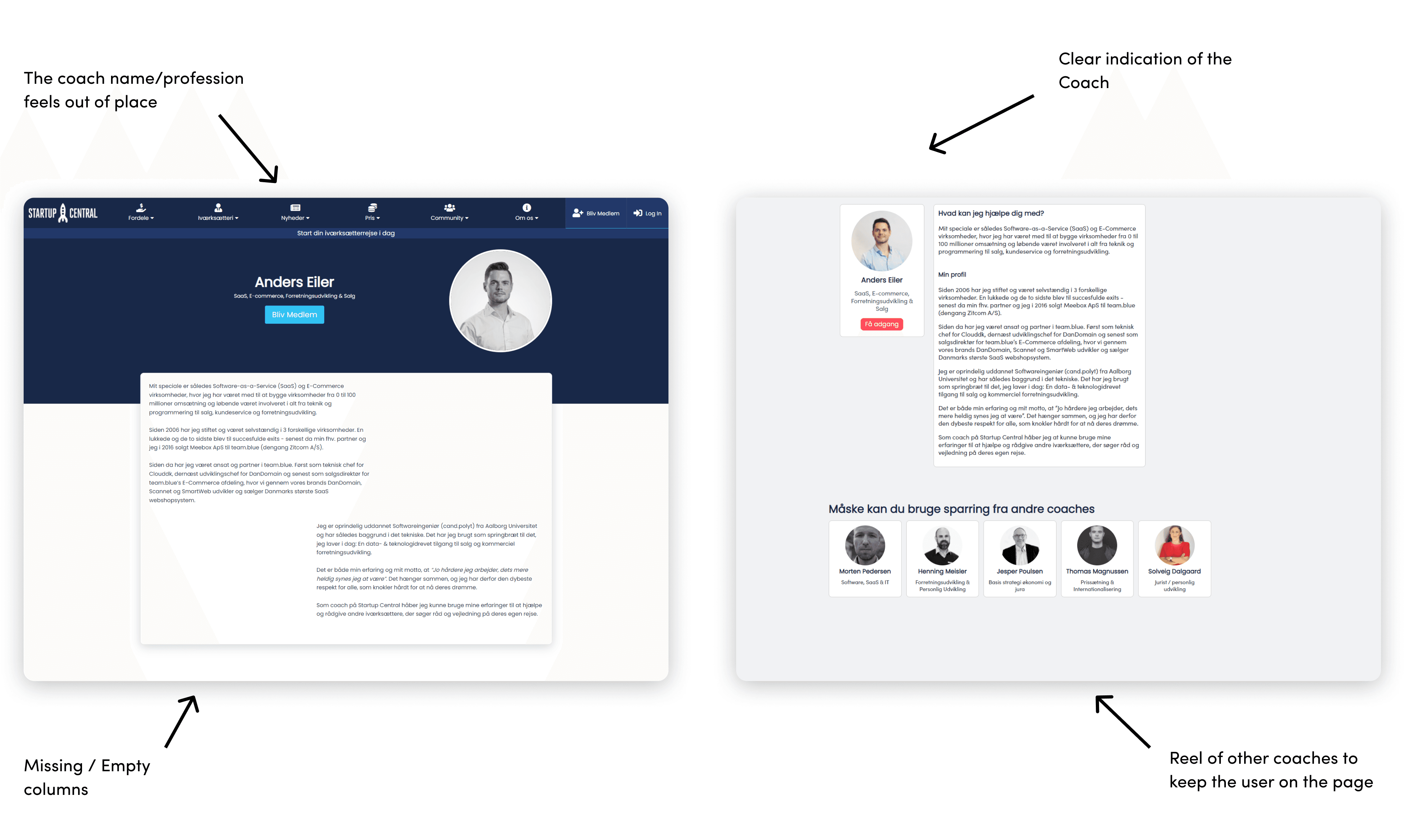
Through the redesign process, The users can see more coaches at a glance, furthermore the search feature is put on the left side, and is following the user eevn during scrolling.
The partners and coaches now are also distinguisheable. The partners site shows 3 columns, with more detailed information plus the benefits they provide.
The coaches card list shows 4 columns and an indication of the coaches' specialization.
Coach Page
The individual coach page was missing information sometimes, furthermore it was hard to read, thus providing an uneasy user experience.
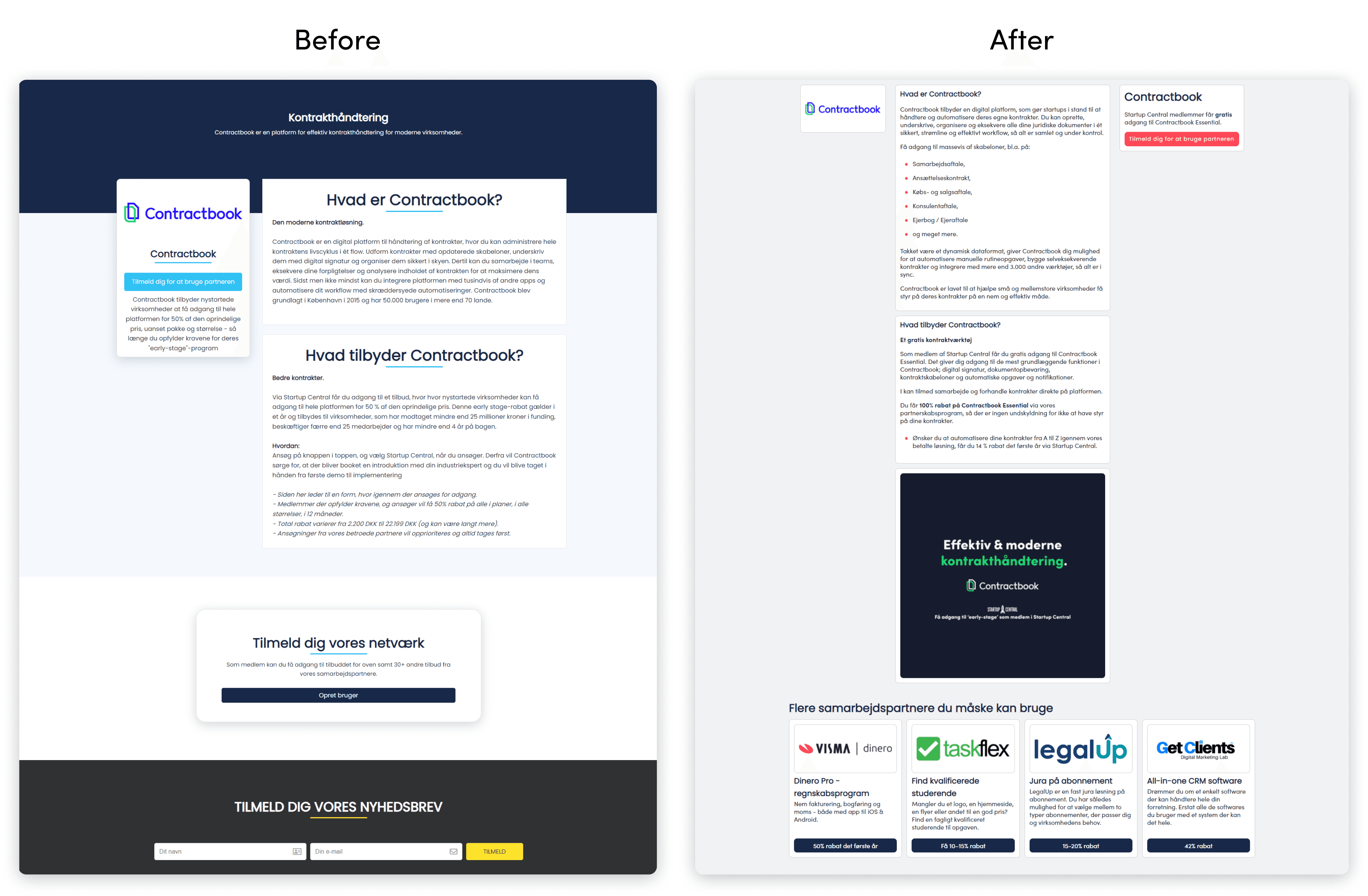
Company Page
While the company page was a better made in the original design, to keep the design similarities through the site. The company page uses a 3 column design, Logo on the left providing all the information in the middle, and a signup quick access on the right.
As with the coach page, partners are also shown at the bottom of the page to keep the user on the site.
Takeaways from the project
The target audiance was happy about the re-design. They could find the information a lot easier than before. They also commented that the site was visually pleasing furthermore easier to navigate than ever.
Laying the foundation
Recreating the main site is only the first step of a huge process and change at StartupCentral. As StartupCentral would like to establish a Social Media like network, laying the foundation on the main site can partly determine the success of the network.
Establishing Brand identity
Creating a visual hierarchy and a color system can significantly improve brand identity. By using the original colors throughout multiple sites that are all connected to StartupCentral, the user subconsciously links them together, even without the indication of a logo.
What I learned
The target audiance was happy about the re-design. They could find the information a lot easier than before. They also commented that the site was visually pleasing furthermore easier to navigate than ever.
Adapt to changes
What seems to be a nice and okay design at first, might not be relevant in the future.
Adapt to the changing consumer behaviour
We needed to stay grounded and focused on the goal, but also account for changes to the product to match the changed behavior of customers.
Take it one phase at a time
We learned to break down complicated designs into small, manageable chunks. This eases development and handles bugs as we go along.