Movement Nights - Software Design
An analytics tool for tracking income and expenses.
Introduction
Movement Nights is an event organisation company based in Hungary. They focus mostly on providing experiences for younger audiences and their proprietary software enables users to create events by selecting venues and artists. Currently, this software is dedicated to event management.
As the company has expanded they started organising events in a bigger volume, moreover they also started providing the beverages for the events. To support this growth Movement Nights would like to integrate an analytics tool for their software to help effectively monitor their income and expenses.
Pain points
Userbase
The primary users of the analytics tool are Movement Nights employees, including event organizers, financial managers, and administrative staff. These employees require a streamlined, user-friendly interface to efficiently track income, expenses, and other financial metrics.
The tool aims to enhance their workflow by providing real-time data insights, improving decision-making processes, and facilitating the overall management of events.
Information Architecture / User Flow
The next step in the process is to define. According to the research that was conducted I was able to figure out what kind of application is going to be created and who the target audience might be.

New pages have been created to incorporate the analytics tool into the software. These pages are designed to house all financial reports and analytics tools.
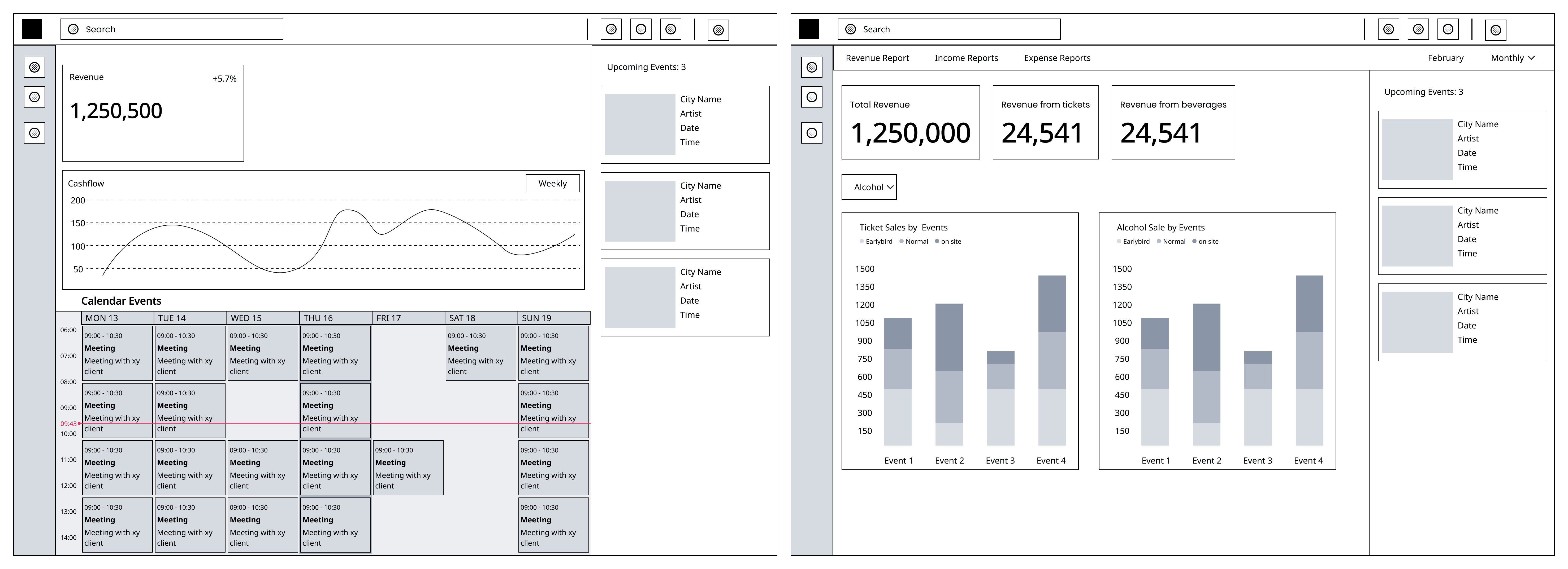
Wireframes
The Movement Nights analytics tool has undergone significant refinement, with the initial wireframes featuring calendar events and an all-encompassing dashboard. The original concept aimed to integrate revenue flows with upcoming event schedules on the homepage. However, this idea was revised based on company feedback, leading to the separation of analytics from event management.
This change has resulted in a more focused and user-friendly tool, specifically tailored to meet the financial tracking needs of Movement Nights employees.
An idea of that iteration can be seen below
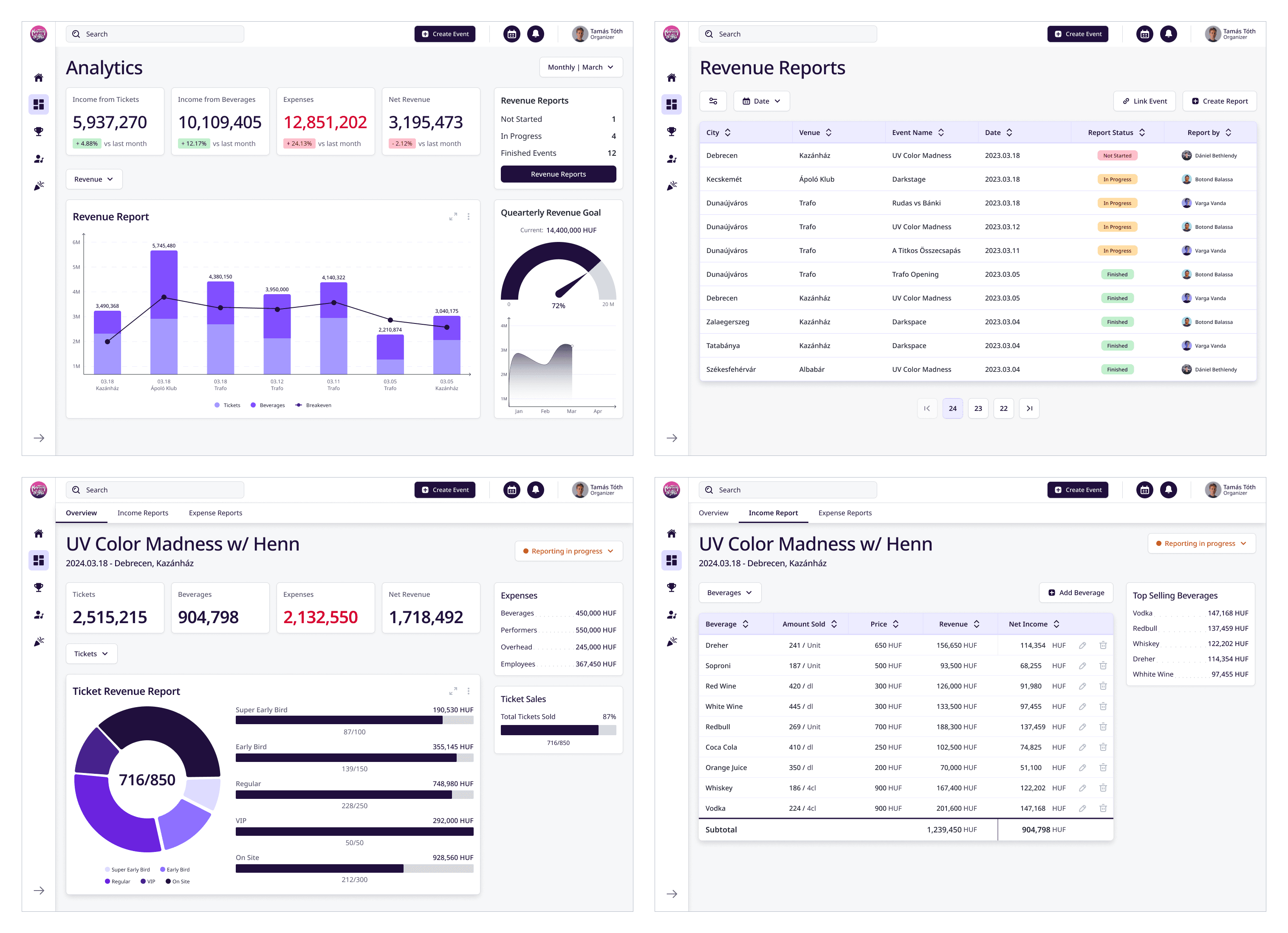
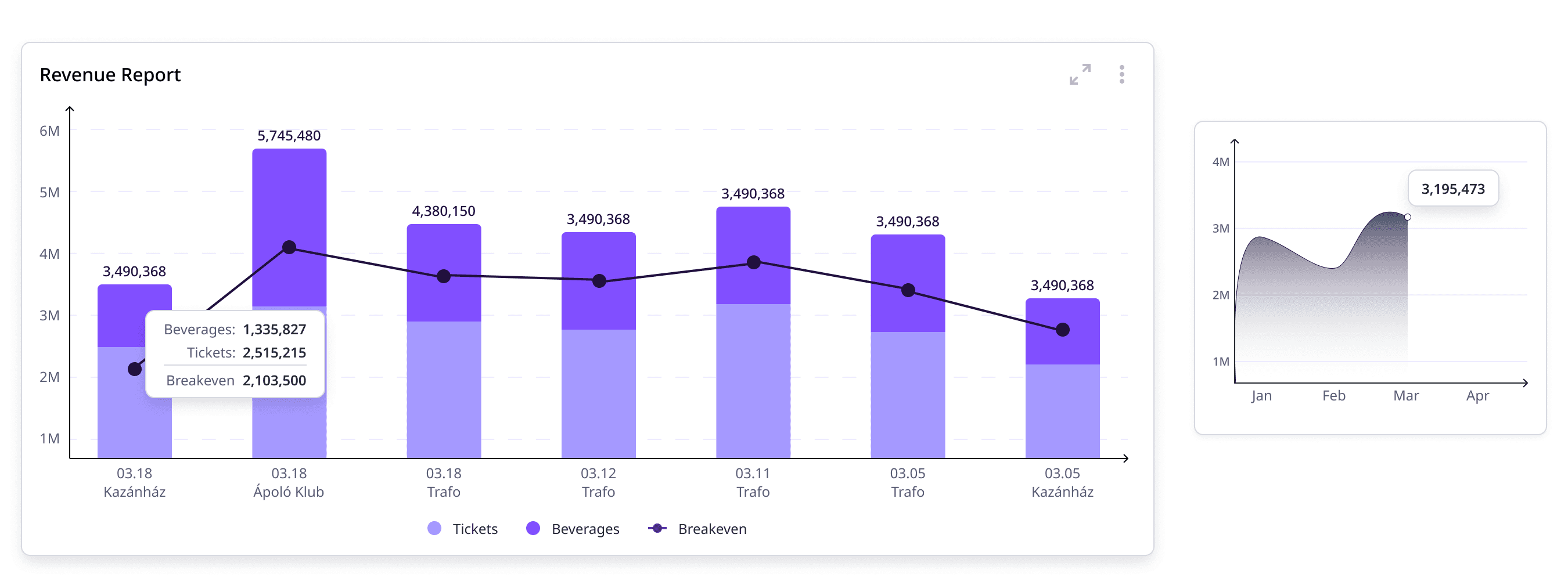
Analytics
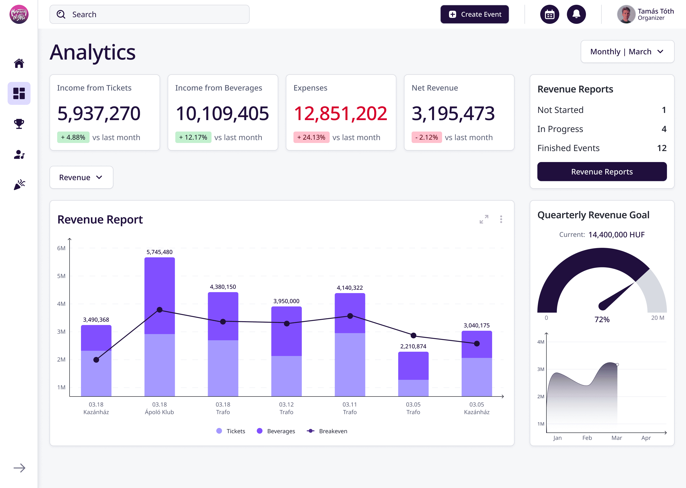
The analytics page shows the key financial metrics that the company is interested in. These metrics can be adjusted for the certain month, year or even for a certain period, by adjusting the filter in the top right corner. The financial metric cards also provide information about financial insights comparing the current metrics to previous months or years.
A bar chart shows the revenue data for different venues over time. The different colours indicate revenue from tickets and beverages. Over the bars, a line chart indicates a breakeven point for each event. To put it simply, if the line is above the bars, the event had operated at a loss.
On the right column of the page, The user can access a list of revenue reports. These reports are put into 3 categories that the user can monitor, “Not Started”, “In Progress”, “Finished Events”.
Under the revenue reports card, a gauge indicating progress towards the quarterly revenue goal, a small graph under it shows the revenue trend for the months in the given quarter.
While hovering, the bar chart, or the graph, the user can access more details about the charts.
Revenue Reports

The page is designed to provide a comprehensive overview of the revenue reports. The page allows the user to create new reports and link said reports to already existing events in the events tab.
It features a table layout that organises important details into columns for ease of access and understanding.
A status indicator visually indicates the progress of each report (Not started, In Progress, Finished) respectively, moreover a profile picture and name indicates who created said report.
Event Analytics
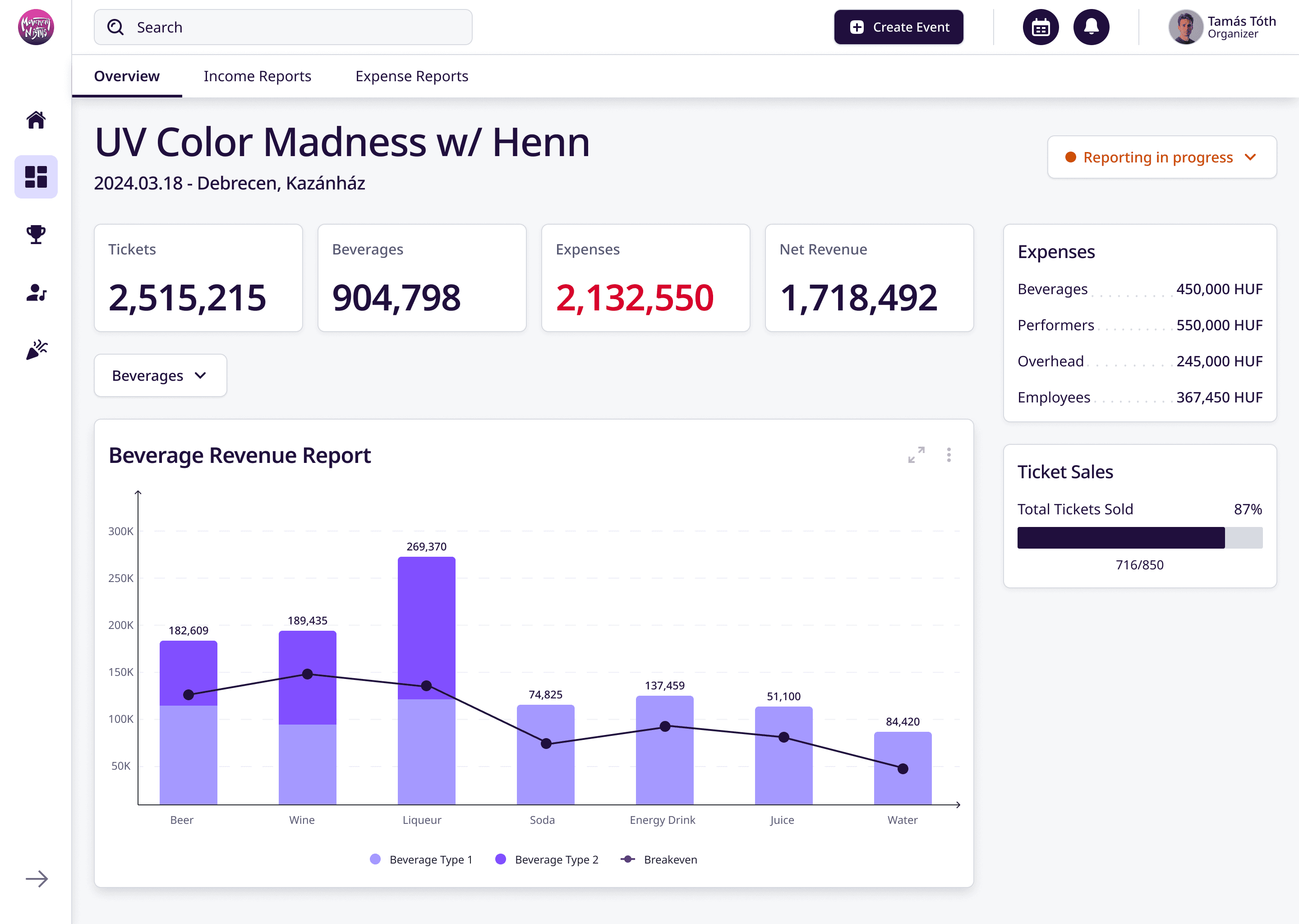
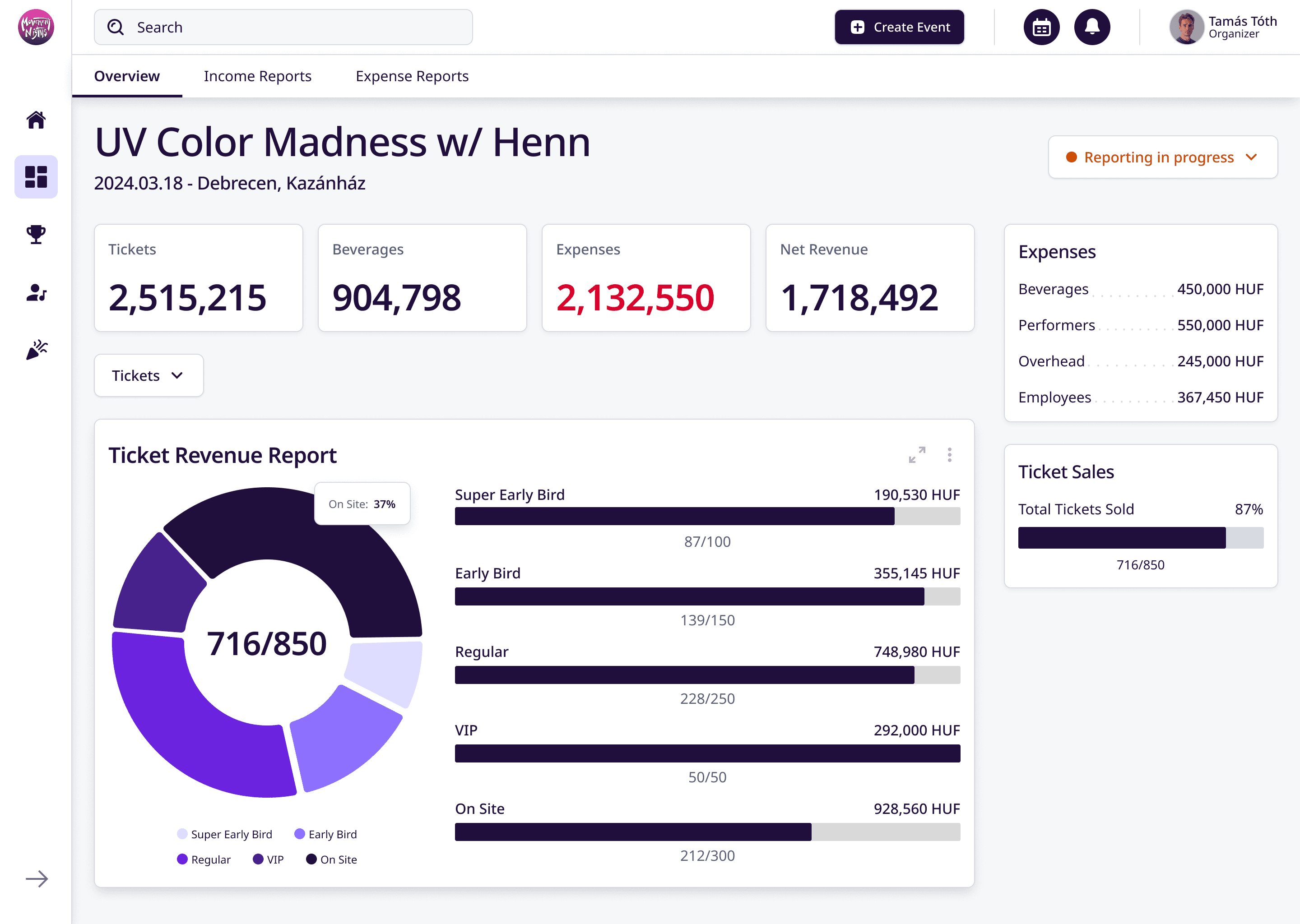
Upon clicking an event on the “Revenue Reports” page, the user is directed to the Event Analytics. To keep the views consistent, the Event analytics page is similar to the main analytics tab. Under the navigation bar a smaller sub-navigation lets the user change what view they would like to see.
On the main Overview page the user can see the name of the given event, the date and the location. Right under the page focuses on showcasing the important financial figures such as income from tickets and beverages, the expenses, and the net revenue. It also highlights the expenses and indicates the amount of tickets sold to show the success of the event.
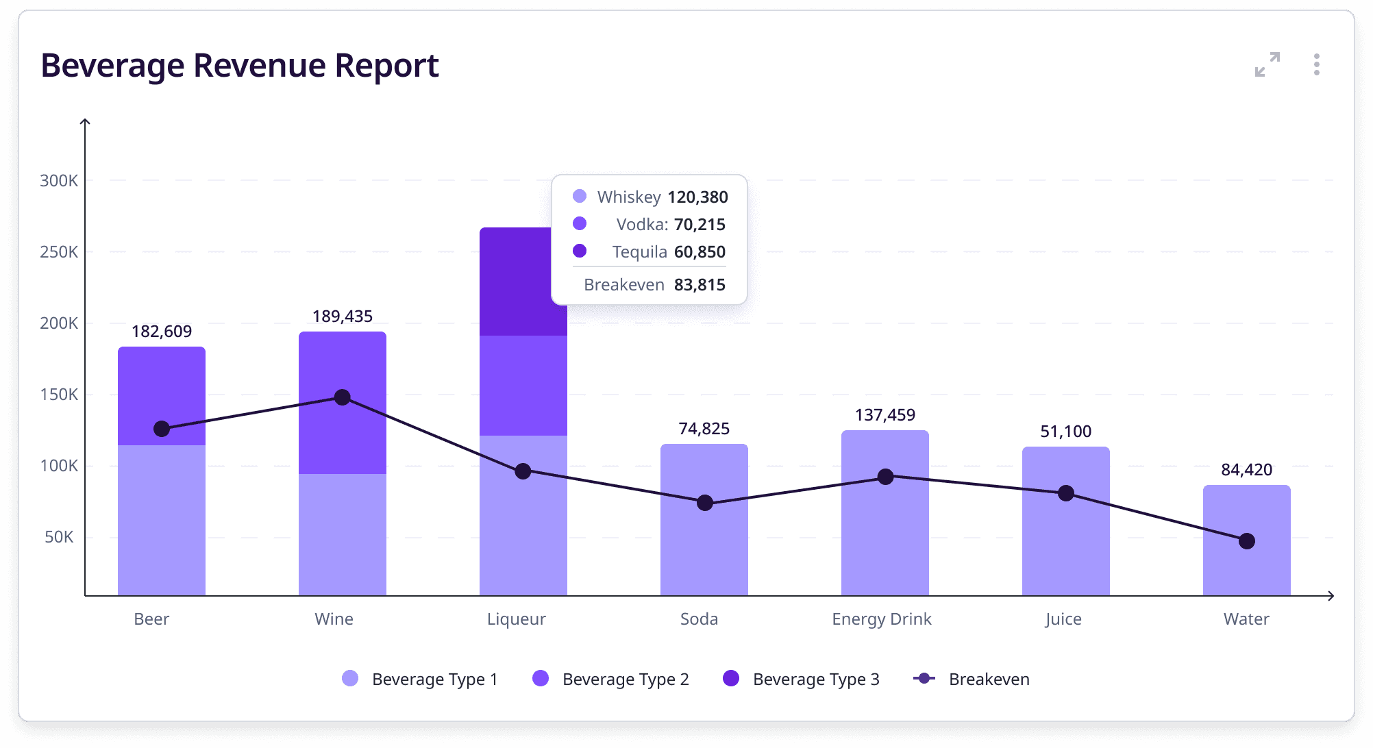
A more detailed view of the revenue report from the beverages is indicated by a bar chart, with a breakeven line respectively. As for the bar chart, main categories have been given for certain beverages, and inside these main categories the chart also differentiate between different types/brands of alcohol. (e.g. Liquor can mean Vodka, Whiskey, Tequila, however in a revenue perspective the purchase price is the same so it is not that important to differentiate.)
To see a detailed overview of the ticket revenue report, the user can switch by clicking on the dropdown menu above the chart. A pie chart shows what percentage of the sold tickets were the certain types, and a progress indicator shows the amounts of tickets that have been sold, for the event, moreover the revenue from said tickets.
These metrics could potentially provide valuable insights for planning future events, and to optimise profitability.
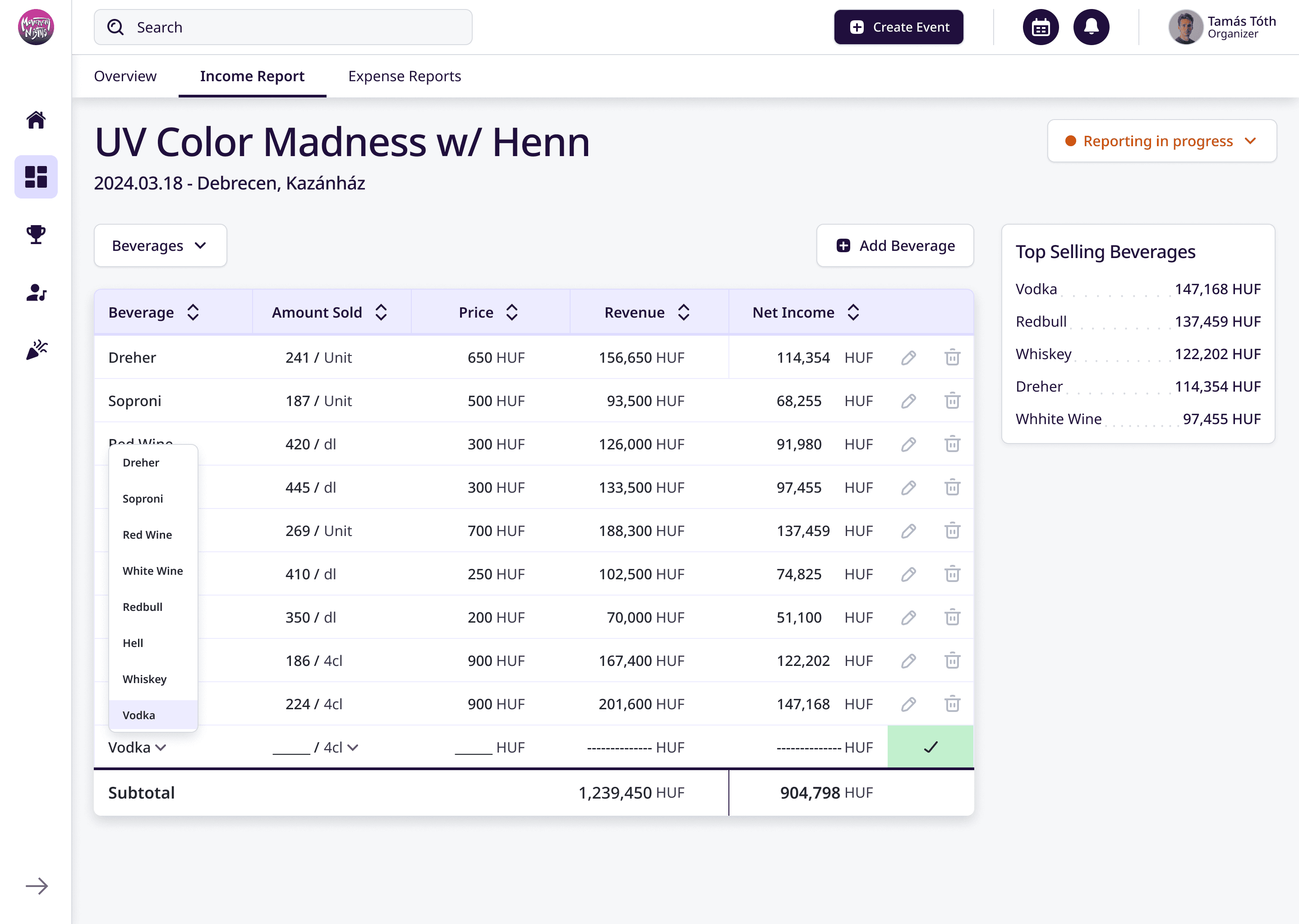
Income Report
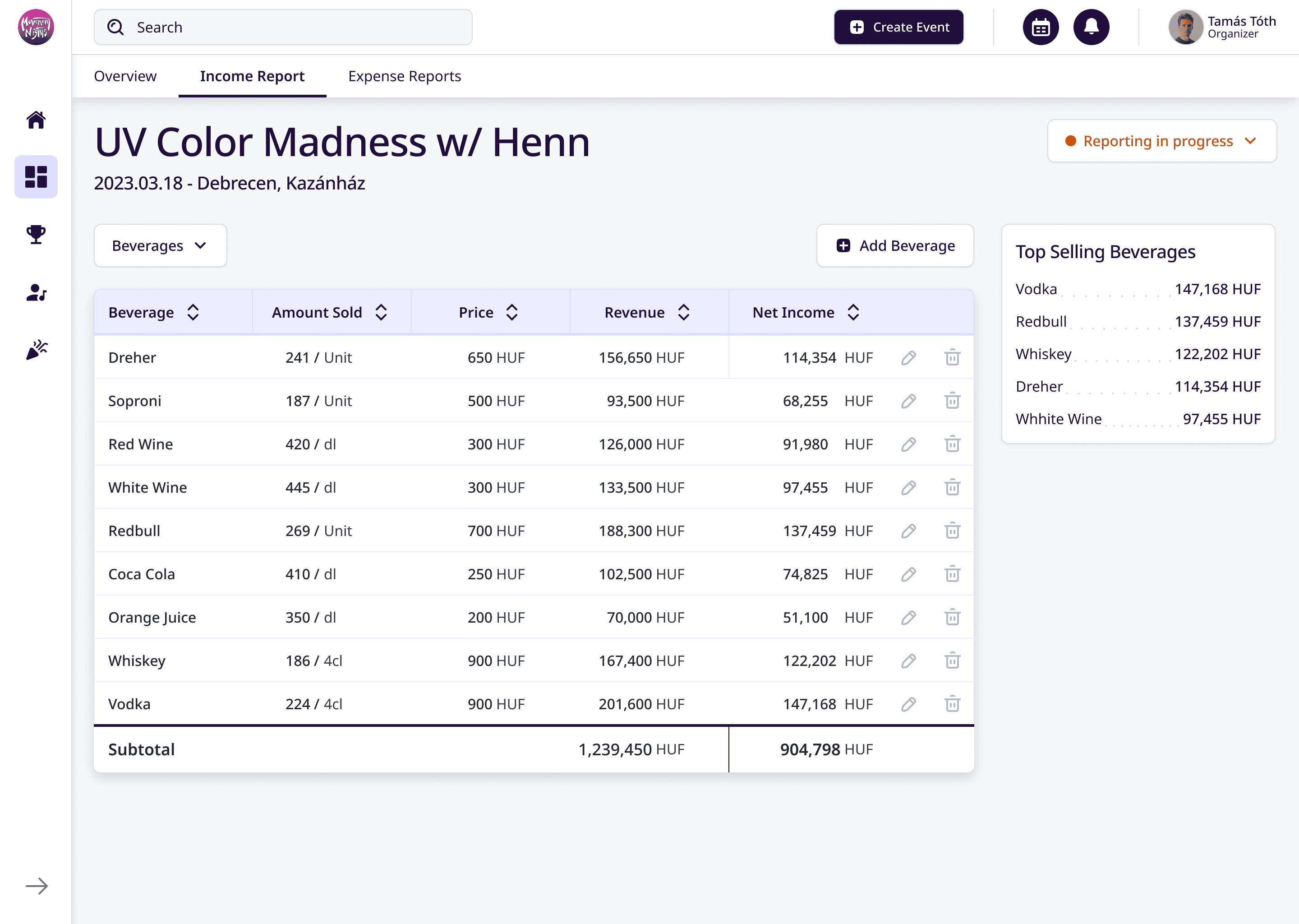
To actually input/update the date shown on the overview page the user will have to navigate to the income report tab. Here the user can easily input the data necessary for the financial analytics. The first 3 columns can be edited by the user, the “Revenue” and the “Net income” columns are calculated automatically. Revenue is calculated by multiplying the amount sold and the price of the beverage, while the Net Income comes from putting the 27% tax rate on the revenue. To make the page more intuitive, in the right column a card indicates the top selling beverages.
By clicking on the “Add beverage” button, the system creates a new row for the given beverage. The beverage and the quantity specification can be picked from a dropdown menu, while the amount sold, and the price can be written manually. When the user is done inputting the data they can confirm it by clicking on the checkmark.
Switching to the tickets tab, the user receives a similar layout just like the one with the beverages. The rows are added and updated the same way, and the calculations for revenue and net income are also the same. Rather than showcasing the top selling beverages the right column switches to indicate the amount of tickets sold, moreover a small indicator also shows the amount of tickets sold for the previous event at the same location.

Expense Reports
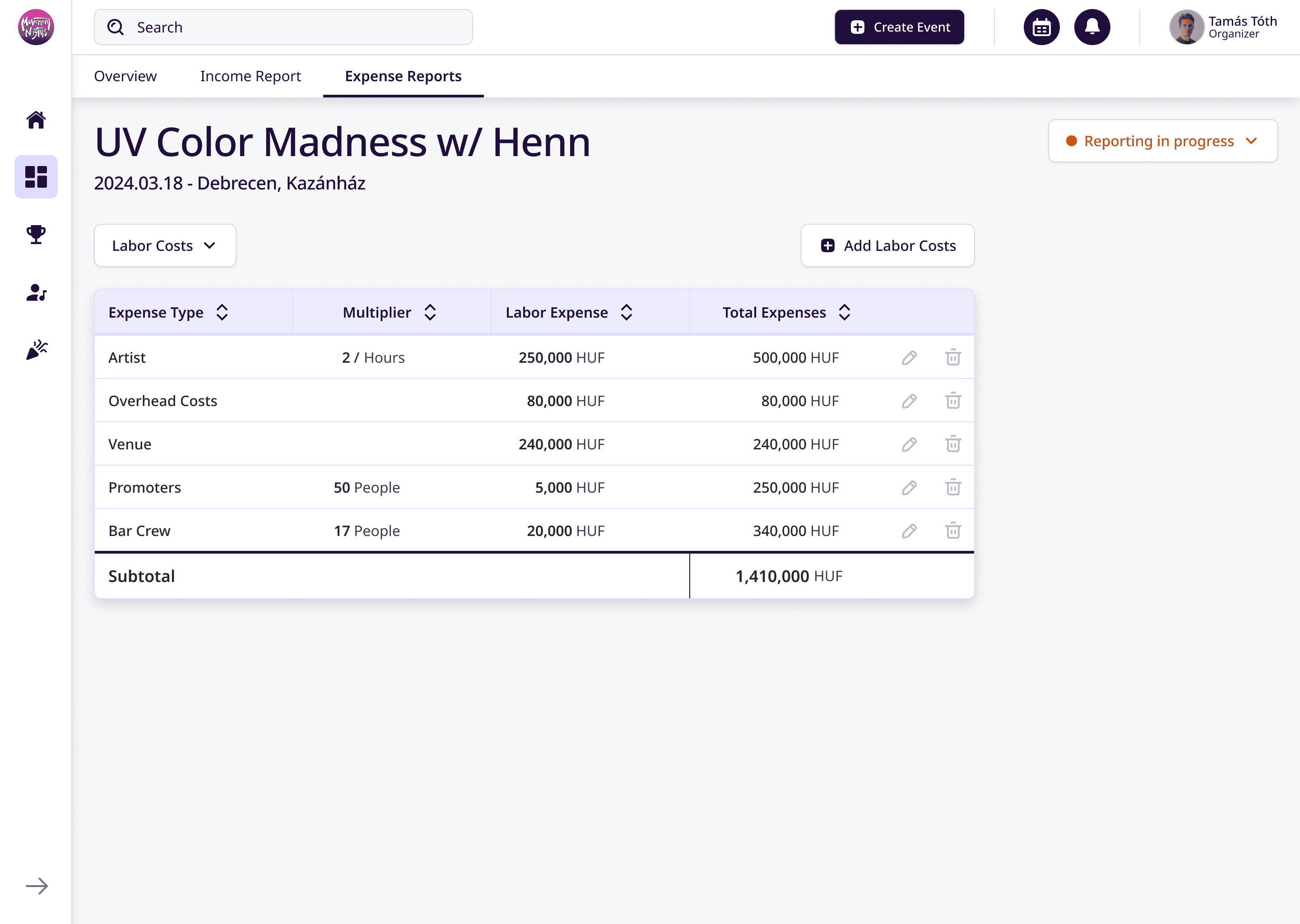
The “Expense reports” page follows the same structure. The user can add different labour costs, set the multipliers and adjust the labour expenses to get the total expense. With the dropdown above the table, the user can change from labour costs to beverage expenses.
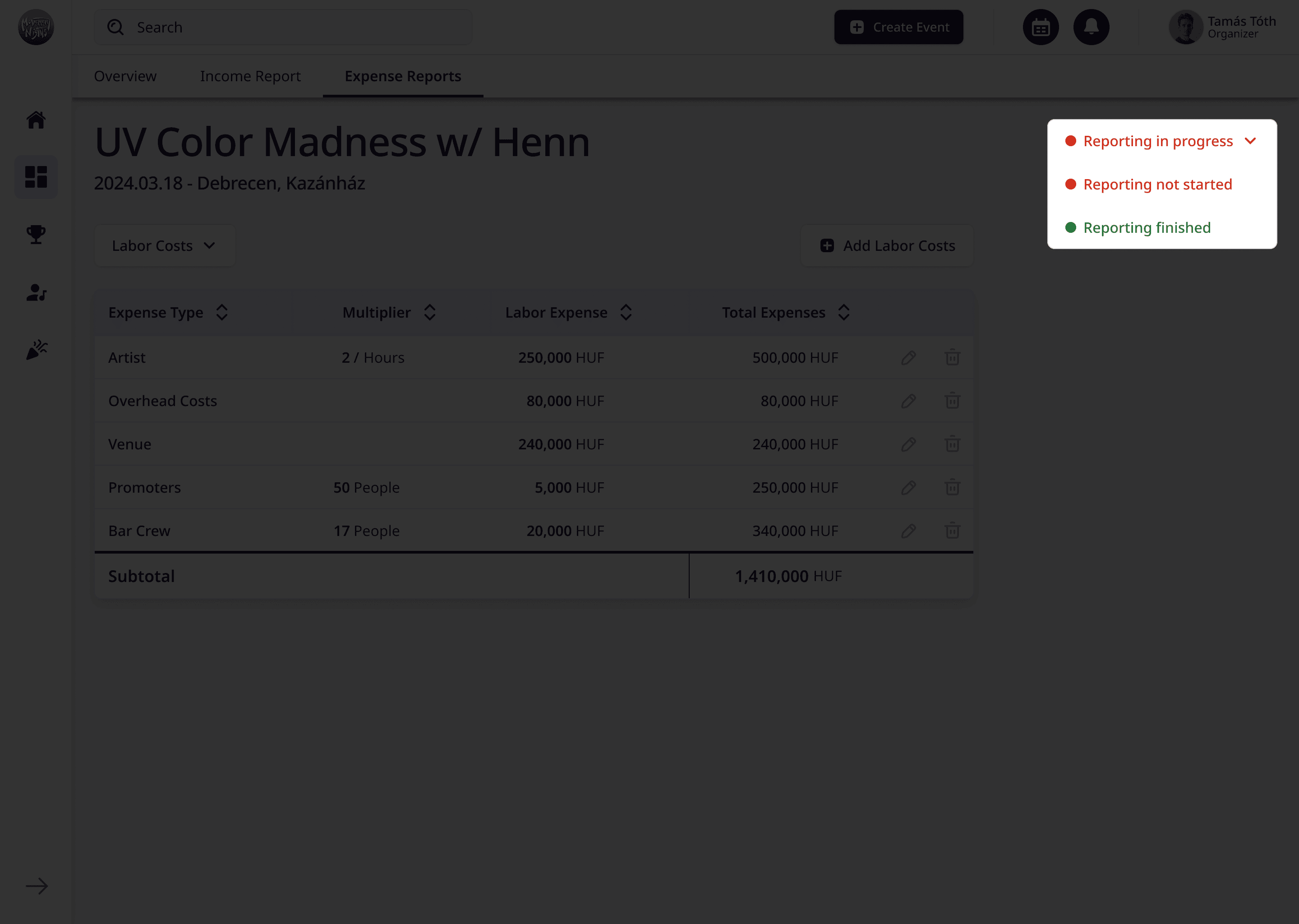
After the user is done adding the various income and expense reports they can adjust the status by clicking the dropdown menu in the top right corner.
Final product
Learnings
Conclusion
The Movement Nights analytics tool enhances the financial tracking and reporting capabilities for the company. It now offers a detailed insight into income, expense and event performance allowing the company make data-driven decisions efficiently. The design successfully addresses the key pain points, and improves user-friendliness for the team.